2
$\begingroup$

I have a few questions about these kinds of graphs

  • What is the name of this type of graph?
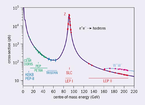
  • What does the width of the peak mean?
  • If the points are data points, how was the curve created/predicted?

So my current understanding of these graphs is that it is a chance of being scattered against the input energy into the system. The higher the peak, the more chance of it being scattered, but if there are peaks at an energy (implying a scattering event) why is the rest of the graph non-zero? Are there particles being produced at the minima also?

Z graph

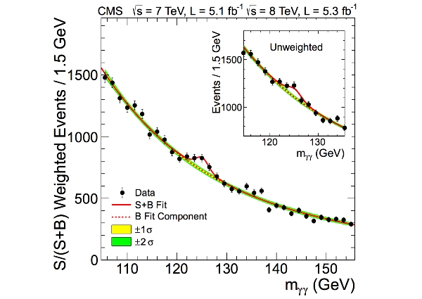
And finally, is this type of graph the same as the now-famous Higgs Boson graph?

Higgs Graph

Images taken from CERN.

$\endgroup$
6
  • $\begingroup$ I apologise, I made a blanket question as opposed to the particular part I do not understand. I have edited it and hope it is now more suitable $\endgroup$
    – Tweej
    Commented May 1, 2016 at 10:12
  • 2
    $\begingroup$ now it is much better :-) (you may find this, this or this useful) $\endgroup$ Commented May 1, 2016 at 10:18
  • 1
    $\begingroup$ Where did you get these plots from? Presumably they came with a caption? $\endgroup$
    – innisfree
    Commented May 1, 2016 at 10:24
  • $\begingroup$ Hi Tweej - you're still asking several different unrelated questions. We'd rather have one question per post, but you can make several posts. (I mean, don't flood the site, but a couple questions at a time is fine.) These are good questions to ask, but in some cases answering them would take a book. I recommend looking at this question and this one, and use what you find to help focus each of your individual questions further. The more specific you are, the better we can help you. $\endgroup$
    – David Z
    Commented May 1, 2016 at 13:53
  • $\begingroup$ The upper plot here says what the dependant axis is in words. That makes its interpretation fairly easy. The lower one uses symbols which makes the interpretation much more context dependent, which is where @innisfree's comment comes in: you need to extract some information from the source of the plot to be sure you have the right understanding of those symbols. It's also worth noting the different scaling of the dependent axis: the top plot is semi-log while the lower one is linear. $\endgroup$ Commented May 1, 2016 at 14:35

0