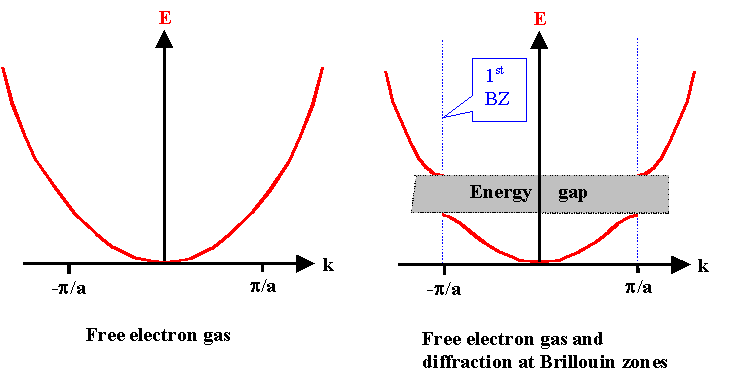
Many introductory books on solid state physics use images that I find confusing. For instance, one picture I see alot when reading about the band gap, is similar to this one:
I understand that the band gap originates due to diffraction near the BZ edges and that the standing wave can be "decomposed" into two waves, with an energy difference - an energy spectrum where the Schrödinger eq. has no solution (tell me if I am mistaking here!). Fine. But in pictures like these, the band with the lower energy stops and the band with the higher energy begins at the edge of the zone? Why is it drawn like that? Surely, the higher energy wavefunction also "exists" inside the 1st BZ and the lower energy wavefunction outside the 1st BZ? If so, could someone direct me to a more telling picture and if not, could you please explain why? As I understand it, the band structure pattern is simply repeated for the other zones.
- One a more general note, the energy bands are usually plotted against the k-vector. What good does it do to have the energy bands plotted vs. the k-vector? The k-vector is a mathematical tool and I understand its true purpose, but I have a difficulty making a physical interpretation of these plots. If someone could expain the logic behind this, I would appreciate it alot. Thanks.

