5
$\begingroup$

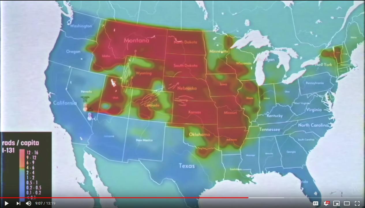
At 9:07 in the latest Veritasium video, we see a map showing elevated levels of iodine-131 in the United States. The big band through the mid-west makes perfect sense to me; nuclear weapons tests loft iodine into the atmosphere, and it eventually falls out with rain. What doesn't make sense to me is why there is a big gap in the fallout, with a hotspot around Vermont and northern New York.

What's going on here?

Map included here: enter image description here

$\endgroup$

2 Answers 2

6
$\begingroup$

Notice that the boundary of the high-fallout region in Idaho, Colorado, Oklahoma, and Illinois is blotchy and blobby and goes gradually from the red through green to blue. However, there is a boundary at the northern edges of Montana and North Dakota that looks like it falls precipitously from the maximum color to a background color exactly at the international boundary.

That seems like a political effect, not a physical effect. The most likely explanation to me is that there is fallout in Canada which makes the red shape mostly contiguous, but that fallout is not shown on this map.

I just watched this video an hour ago, and I've already forgotten whether this map shows on-the-ground measurements or a weather transport model. If it's a weather model, it's kind of ugly to include air transport over Canada but then hide those parts of the results — though US government caginess about radioactive fallout was a major point of the video. If this map shows on-the-ground measurements, then the US may just have not sent into into Canada to collect the data from the ground, which is slightly less ugly.

$\endgroup$
6
  • $\begingroup$ It looks like there are similar boundaries at the northern edges of Arizona, New Mexico, and Texas. $\endgroup$
    – mmesser314
    Commented Sep 17, 2020 at 8:24
  • $\begingroup$ For the red region, yes. But each of those southwestern states has blobby boundaries between dark blue, light blue, and (apart from Arizona) green, while Canada and Mexico are a completely uniform color. $\endgroup$
    – rob
    Commented Sep 17, 2020 at 13:39
  • 1
    $\begingroup$ This takes me back to one of my very first scientist-like experiences. I was in elementary school and we were taking a quiz about how to read a color topographical map, and I sweated over the question “where is the elevation the highest” while I hunted for some hard-to-find white circles on the Colorado Plateau. When we discussed afterwards, the teacher asked that question and then said, in unison with the class, “Mexico!” — because Mexico was printed in a light grey “no data” color. I protested that the Rio Grande river probably didn’t run at the foot of a 14,000-foot cliff. $\endgroup$
    – rob
    Commented Sep 17, 2020 at 13:48
  • 3
    $\begingroup$ The units are rad/capita. Is this reported from health data? Then it is more understandable that only U.S. data is included. Perhaps reporting is incomplete for some states. $\endgroup$
    – mmesser314
    Commented Sep 17, 2020 at 14:01
  • $\begingroup$ This is an interesting idea, but I don't know that it totally solves the problem. If there is missing data from Canada, won't the red blob will still look weird as it wraps around Ohio and Michigan? $\endgroup$
    – Ryan_L
    Commented Sep 17, 2020 at 16:06
1
$\begingroup$

This may be related to the Atlas missile silos that were located in the area.
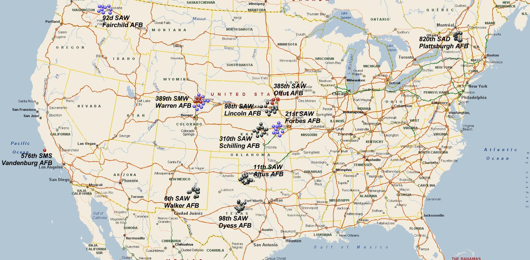
enter image description here (Source)

It is very possible that there was a disaster on the base that was never publicized. The Atlas silos were plagued by problems. Our government has been far from transparent when it comes to nuclear disasters. For example the large contamination plume released at Rocky Mountain Flats was not broadcast publicly for about 20 years.

The U.S. Air Force lists Plattsburgh among its BRAC "success stories."[12] The base's reuse and the circumstances surrounding it were chronicled in Flying High Again: PARC's Redevelopment of Plattsburgh Air Force Base, written by Marian Calabro and published by CorporateHistory.net in 2008.[13][14] While digging for new PARC construction was underway low level nuclear materials (such as contaminated protective clothing) were found buried. The levels of radiation were safe and the area was decontaminated.

(Source)

However, This is an is a iodine 131 per capita so it is possible that this area imported more milk from contaminated areas. Also, this study is obviously concentrated on the United States. I do not believe that it was politically motivated or had any intention to convince the world that the contamination did not spread further northward. However, if this was concentrated on the spread of contamination due to milk, it would make sense that Canada was ignored since they were a exporter of milk. And during that time period they exported less to the USA leaving them with a surplus during the time. This means that our contaminated milk would not have moved north due to supply and demand.

This image seems to suggest that the contamination was more likely due to the military base in the area as it was based on ground measurements.
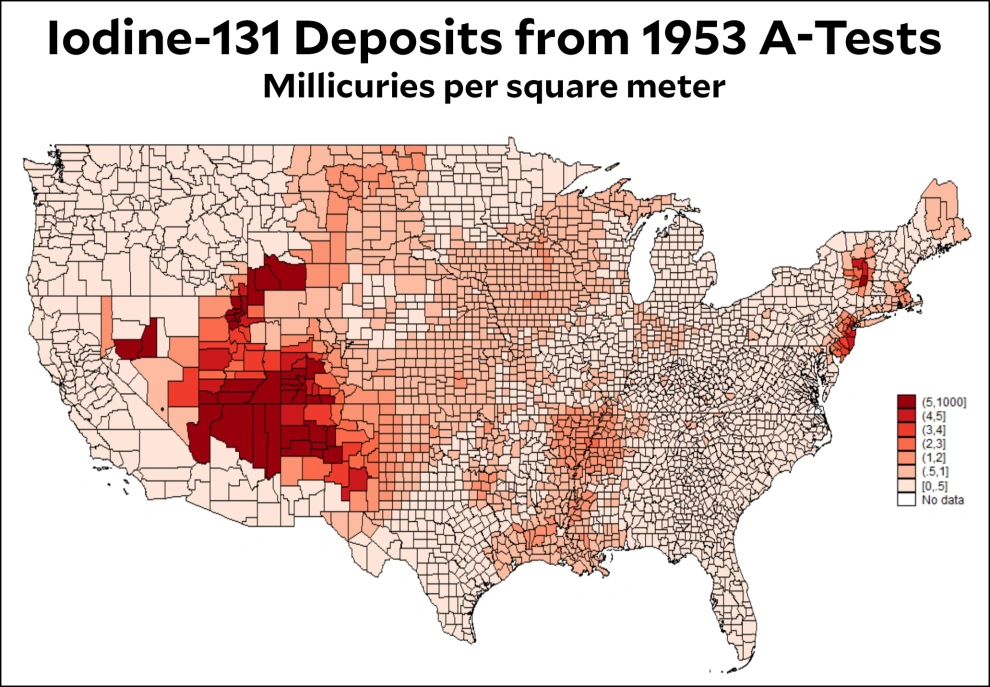
https://www.motherjones.com/wp-content/uploads/2017/12/blog_i131_deposits_1953_atomic_tests.jpg?resize=990,687

Notice how the two do not share complete commonality, but are very similar.

One last note on Canadian dairy, it would seem (if this image is accurate) That most dairy cattle are located far east of the primary fallout areas.
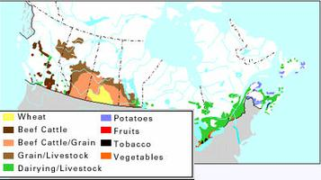
enter image description here

$\endgroup$

Your Answer

By clicking “Post Your Answer”, you agree to our terms of service and acknowledge you have read our privacy policy.

Not the answer you're looking for? Browse other questions tagged or ask your own question.