Why is the temperature axis of the Hertzsprung–Russell graph increased from right to left?
Is it to do with polynomial proportionality?
Because it is plotted against colour index, which is the difference in blue and visible magnitudes.
Higher colour index (increasing left to right) means blue magnitude is higher (ie star is fainter) in the hot blue light than in the visible and so the star is cooler.
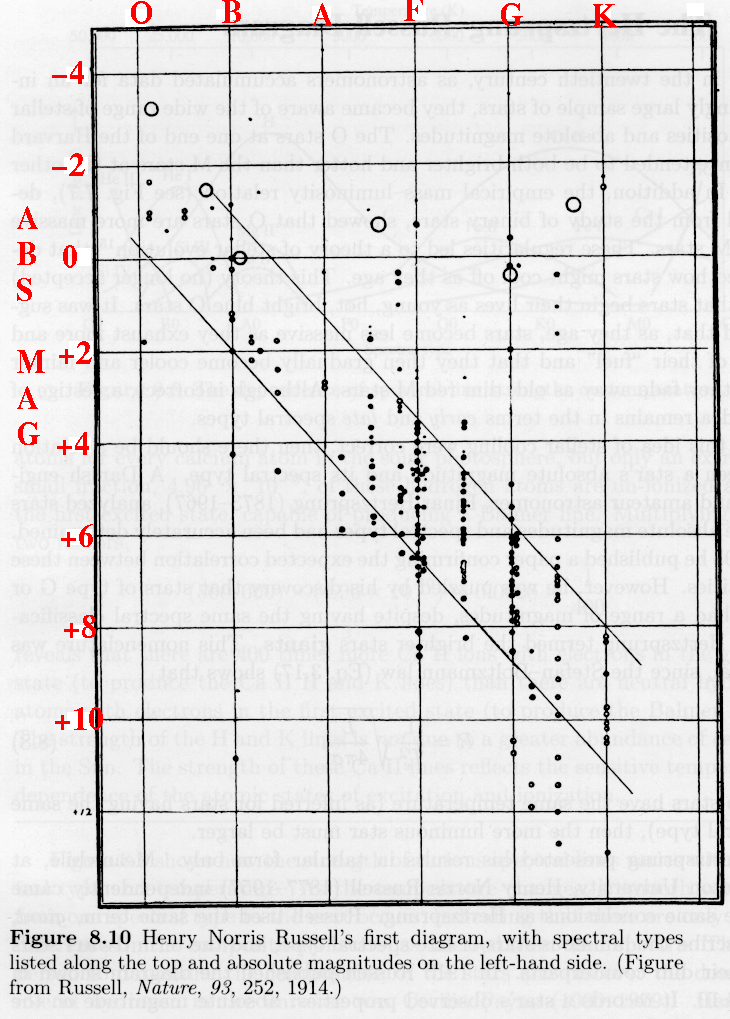
The original H-R diagrams developed by Hertzsprung, Rosenberg and in particular Russell (who although was not first, was probably most influential) did not use temperature along the x-axis at all; they used spectral type or effective wavelength.
At that time it was not clearly understood what the changing spectral type meant in terms of physical stellar parameters. In this case, the ordering of stars, for instance in terms of the increasing prominence of absorption lines due to metals is caused by decreasing temperature.
Thus it turned out that the original plots had temperature decreasing to the right as the strength of the Fraunhofer lines increased or as the effective (peak) wavelength increased (due to Wien's law), and subsequent plots were always made in that same way.
Below is a diagram from Russell's influential Nature paper from 1913. However, it is important to note that versions of this diagram had already been produced by Rosenberg and Hertzsprung a couple of years earlier using the strength of the Calcium H and K lines (which increase with decreasing temperature) or the effective wavelength (in Angstroms) respectively. Hertzsprung's original diagrams for the Hyades and Pleiades are shown at the bottom.
Note that none of these original diagrams used a colour index on the abscissa.
Russell's 1913 diagram showing absolute magnitude versus spectral type.

Hertzsprung's diagrams of apparent magnitude (all stars are roughly at the same distance in a cluster) versus "effective wavelength" in the Pleiades and Hyades clusters (from 1911).