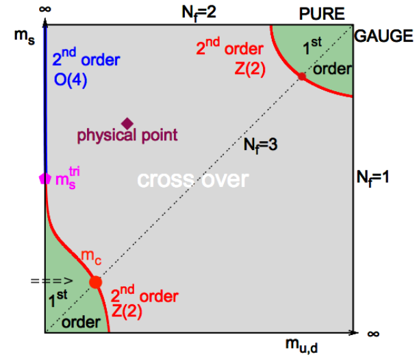
In High Energy Physics papers, I often see a diagram as shown below:
I am still studying Quantum Field Theory, and I could not understand the only reference I could find about this plot: https://arxiv.org/abs/1702.00330. What I know for sure is that the y-axis is strange quark mass, $x$-axis is light quark ($u$ and $d$) mass. And the third axis coming out of the plane is chemical potential ($\mu = 0$).
- What are the various features of this plot (in a simpler language)?
- Why are masses taken as variables when we know their values to be constants?
- What is the significance of this plot?
- How is it related to QCD phase diagram?

