1
$\begingroup$

I have recently begun tracking the temperature data available from my Nest thermostat. Among other things, the hope is to use this data to measure the effectiveness of additional insulation and other miscellaneous energy saving projects performed around the house.

For instance:

| Timestamp         | Target Temperature | Current Temperature | Outside Temperature | Current Humidity | Outside Humidity | HVAC State | Auto Away |
|-------------------|--------------------|---------------------|---------------------|------------------|------------------|------------|-----------|
| 3/7/2016 7:37:59  | 58                 | 61                  | 54                  | 53%              | 43%              | FALSE      | 0         |
| 3/7/2016 8:08:00  | 58                 | 61                  | 57                  | 55%              | 41%              | FALSE      | 0         |
| 3/7/2016 8:38:00  | 58                 | 61                  | 57                  | 55%              | 41%              | FALSE      | 0         |
| 3/7/2016 9:08:00  | 58                 | 61                  | 60                  | 55%              | 36%              | FALSE      | 1         |
| 3/7/2016 9:37:59  | 58                 | 61                  | 60                  | 55%              | 36%              | FALSE      | 1         |
| 3/7/2016 10:08:00 | 58                 | 61                  | 63                  | 53%              | 34%              | FALSE      | 1         |

[full data set linked above]

However (as you have probably surmised), this is more easily said than done as, among other things, the exterior temperature is never constant and therefore makes such calculations rather difficult.

Are there any logical conclusions one could make from the roughly 2,000 rows of data I have collected so far? I was hoping for pretty basic things like, "when outdoor temperature is below X degrees, heat loss is Y degrees per hour".

$\endgroup$

1 Answer 1

0
$\begingroup$

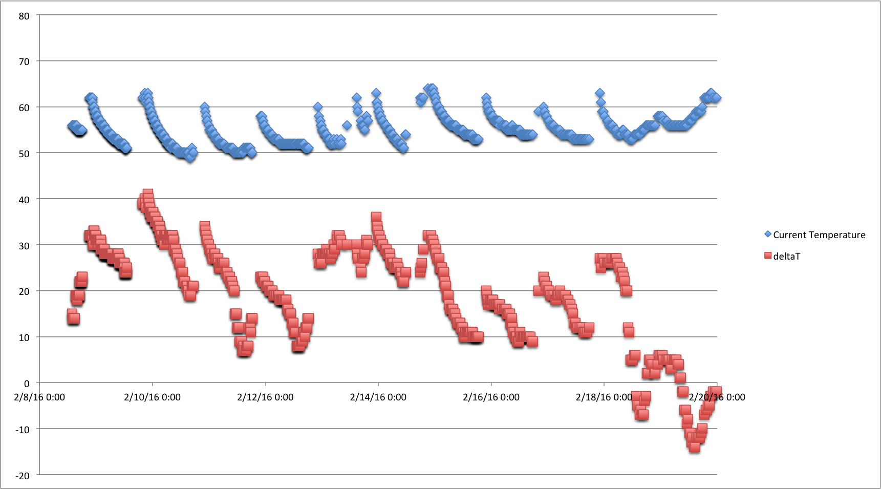
The simplest thing is to plot the evolution of the temperature as a function of time - I filtered the data on "HVAC=FALSE", then plotted both the indoor temperature, and the difference between indoor and outdoor temperature:

enter image description here

I recommend you do this, then look at the slope of the "decay" (blue) curves as a function of the temperature difference. You have to do this separately for each cycle, and it will involve some smoothing of the data as you have a lot of data points where the apparent temperature change between adjacent data points is zero (because the temperature is measured in discrete degrees). Probably your best bet is to fit one slope to each cycle, and plot that slope as a function of the average temperature difference for that cycle.

Incidentally you can see that the last two cycles of data have a rising slope (in part) as the temperature difference is changing sign (that is, it is warmer outside than inside).

It's quite a bit of work to extract meaningful "cooling factors" from the data - it does look like the curves descend more steeply when the temperature difference is bigger, but you have to do a lot of massaging of the data to really extract reliable information from it.

$\endgroup$

Your Answer

By clicking “Post Your Answer”, you agree to our terms of service and acknowledge you have read our privacy policy.

Not the answer you're looking for? Browse other questions tagged or ask your own question.