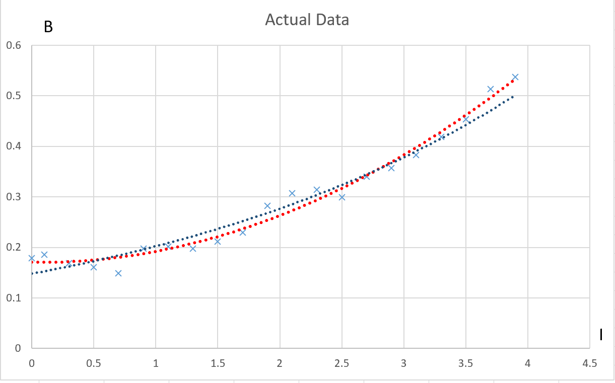
I in the experiment, I have tried to find a relationship between a quantity B and quantity I. First I plotted the raw data into a graph and tried different curve fits in excel. This is the graph that I got:
As you can see, B is plotted vertically and I is plotted horizontally. I also added the two curve fits; the red curve is a second-degree polynomial, and the blue curve is exponential. It would appear that the polynomial curve fits much better. However, then I did a trick we were taught. I assumed that the relationship would be of the form B=kI^c, where k and c are constants. Then I "took" the logarithms of both sides: lnB=ln(kI^c)=lnk + cln(I). If ln(I) is plotted against lnB, I get the following graph:
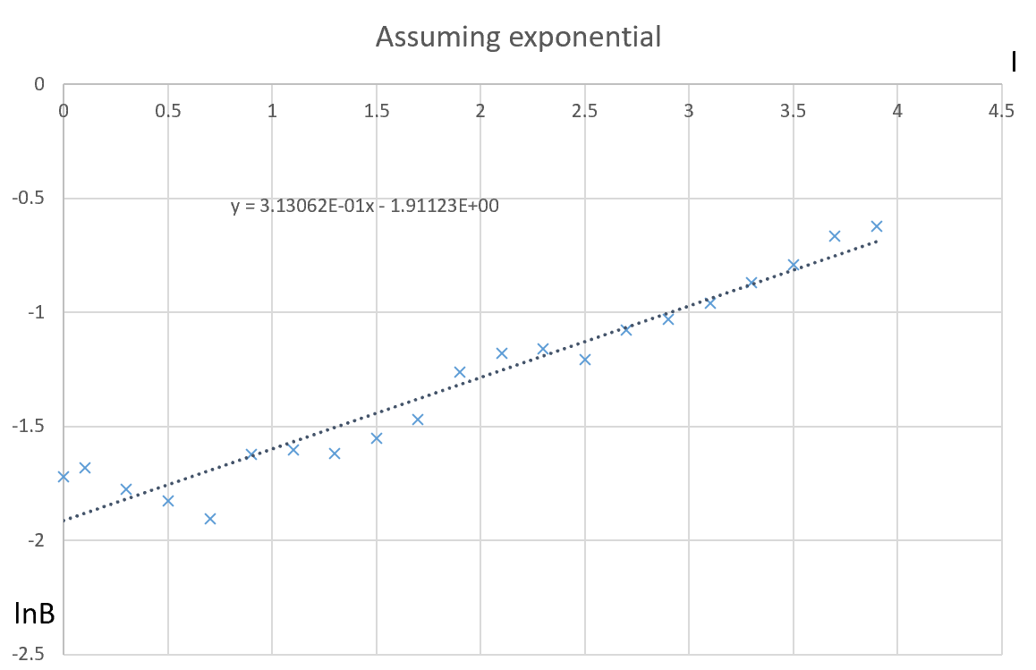
As you can see, this is nowhere close to a line, and what more it actually kinda looks like the original polynomial curve. This was what first got me to think that the relationship was exponential. When I did the same trick but assumed that B=e^(cI), therefore lnB=cI*lne. So I plotted I against lnB and I got this curve:
Although the trendline does not pass through all the points, the overall trend seems to be linear. But in the first graph, the polynomial seemed to be the clear favorite. Why? Which one should I go with?


