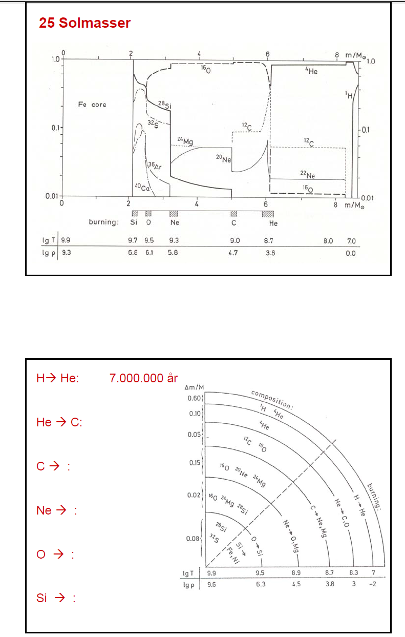
I think the colloquial term for that type of plot is "spaghetti diagram" because you have a bunch of lines running across it. It's really the mass fraction as a function of interior mass. From our stellar structure equations, we have that
$$
\frac{dm}{dr}=4\pi r^2\rho,
$$
which is derived from the mass-continuity equation, so you can relate the radius, $r$ (in solar radius units) to the mass (given in solar masses). This type of Lagrange coordinate is the standard for these plots though.
Basically, the plot shows the dominant element(s) as you go deeper into the star. The closer to 1.0 it is, the more you're going to find that element. The sharp peaks/drops arise from nuclear burning--fortunately for you, those are labeled at the bottom, this is not often the case! Note that towards the right side you see ${}^1{\rm H}$ starting to peak while ${}^4{\rm He}$ starting to fall, this is where hydrogen burning takes place; this also indicates that your plot extends much further than what is shown there (which makes sense, given that your plot extends to a little over 8 solar masses for a 25 solar mass star!).
So, for instance, at around 6 solar masses, you have helium burning (triple-alpha process) that produces carbon-12 while destroying the helium. Carbon burning at about 5 solar masses destroys the carbon while producing neon-20 and magnesium-24. And similarly for the other burning processes. Note again, though, that each burning produces more elements than what is shown here, this is only showing the dominant species produced.
There is no time evolution in this diagram. This is simply showing you how much of each element at one particular time. The type of plot that shows a time-evolution is called a Kippenhahn diagram (see this, for instance). These are a bit more complicated, but really only show the burning processes as a function of time, rather than a mass fraction of abundances.

