0
$\begingroup$

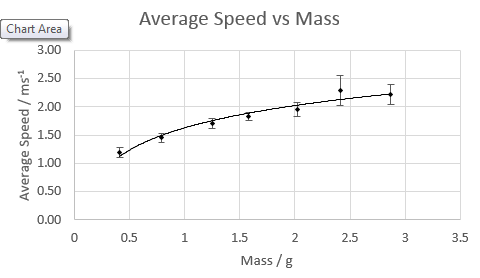
I am doing a practical write up of an experiment I did. Here is a graph using the raw data I got.

enter image description here

What is the general formula of this graph, and what do I need to do in order to make that into a straight line graph? Take the natural log of the average speed and plot it against mass? Excel gives me the specific equation of the line, but I need to write down a general equation in order to get max marks.

Or could it be that my empirical data is wrong with the theory?

I'm having trouble understanding the maths here.

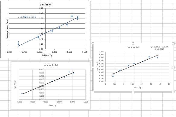
Edit: Here are attempts at straight line graphs I have made. ln v vs ln M looks the straightest, is that the one I should therefore use?

enter image description here

Can someone walk me through how I change the general formula of the first graph into the general formula of a straight line graph?

$\endgroup$
3
  • $\begingroup$ It looks like average speed depends on the square root of the mass. Anyway, what are you trying to prove/disprove with you experiment? Anyway, yes, try plotting log(x) vs log(y) and show here what you get $\endgroup$
    – Lelesquiz
    Commented Jun 13, 2014 at 12:49
  • $\begingroup$ It's just an experiment, the question is "How does the addition of mass to a paper cupcake case affect the average speed of it falling?". I'll add the other graphs I've made to the first post. $\endgroup$
    – Jim
    Commented Jun 13, 2014 at 12:55
  • $\begingroup$ The best results come from a relationship that makes physical sense. Maybe instead of speed you plot kinetic energy and then a nice line might show up. $\endgroup$ Commented Jun 13, 2014 at 13:58

4 Answers 4

2
$\begingroup$

You should base the function on the experiment you did and some reasoning.

Just mathematically, there are an infinite number of functions that exactly include every point in the data set.

Read about terminal velocity.

$\endgroup$
4
  • $\begingroup$ I don't understand... can you give me an example? If it was a concave upwards hyperbolic curve, the general equation could be: $v=k e^{-nM}$ right..? where k and n are constants $\endgroup$
    – Jim
    Commented Jun 13, 2014 at 13:03
  • 1
    $\begingroup$ For any two point, there exists a line (first order polynomial) passing through the two points. For any three points, there exists a line or parabola (second order polynomial) passing through the three points. If you used a high enough order polynomial, you could find one that passes exactly through the data points. But that's not what you want to do. $\endgroup$
    – DavePhD
    Commented Jun 13, 2014 at 13:10
  • $\begingroup$ Someone suggested v depends on the square root of the mass, so if I plot $v^2$ against $M$ I should get a straight line..? Will that suffice then? $\endgroup$
    – Jim
    Commented Jun 13, 2014 at 13:14
  • $\begingroup$ I think that's a good thing to consider $\endgroup$
    – DavePhD
    Commented Jun 13, 2014 at 13:22
0
$\begingroup$

The first of your queries - ''What is the general formula for this graph?'' got an appropriate answer from @DavePhD, which I second completely. As for the other query, which I adapt to read as '' How do I find an appropriate straight line which fits this data'', the general procedure goes by the name of Least Square Fitting, which is a general method to ensure that the mod-squared deviations $|(y-y_i)|^2$.

From what appears to me by reading your post, you probably don't know about this yet, so I'll summarize the procedure for you. (Also, I feel your instructor would be happier if you got the fit yourself rather than have Excel do that for you.)

Procedure -

Let's denote your data points by $(x_i, y_i)$. Assume fitted straight line had the equation $$y = mx + c$$ where $m$ is the slope and $c$ is the intercept. These two coefficients have to be determined to uniquely identify the straight line, for which you need two equations:

$$ \sum_i y_i = m \sum_i x_i \ \ + nc$$ where n is the number of data points, and $$ \sum_i (x_i y_i) = m \sum_i x_i^2 \ \ + c \sum_i x_i$$

Therefore, from your raw data, evaluate these sums, and you will end up with two equations in two unknowns, which you can easily solve to determine $m$ and $c$.

Some time when you are free and feel curious about it, get your hands on Advanced Engineering Mathematics by E. Kreyszig, and figure out how this procedure minimizes the least square deviation for a bunch of points that are distributed around this straight line.

$\endgroup$
0
$\begingroup$

Without posting the data table is difficult to say what would work best. In general, I always try to find how my quantities are related using physical intuition or dimensional analysis and then I used the data to fit my model.

In your case, I recommend looking at mass $m$ vs. energy $\frac{1}{2} m v^2$ or specific energy $\frac{1}{2} v^2$ and see which model makes more sense.

You really need to post more about the experiment and what the numbers represent before anything meaningful can be stated. This is the reason computers will never replace humans in science because it is not just about the numbers.

$\endgroup$
0
$\begingroup$

Beware of using a tool you don't understand... "Excel give me..." is a sentence that sets alarm bells off in my head.

A few points:

  1. When you do an experiment, you should formulate a hypothesis regarding the underlying physics before you look at the results. "I expect that the terminal velocity will scale linearly with the mass of the cup" could be such a hypothesis. It would be best if you used some physical reasoning to come up with the hypothesis (just saying "it will be linear", while a hypothesis, is really just guessing). Ideally you set up the experiment to help you prove / disprove the hypothesis.
  2. In order to get a straight line, you transform your data according to your hypothesis. If you think that $y = a x^2$, you could plot $y$ as a function of $x^2$ and would expect a straight line. This has two advantages: a) the slope of the straight line will be the parameter $a$, and b) you will be able to see a systematic deviation from the straight line readily
  3. Plot the residuals. Sometimes, you have data that looks like a beautiful straight line; but if you compute the fitted straight line and subtract it from the data, the result might have some definite shape (curvature). This could happen because of some small non-linearity you didn't account for in an otherwise careful experiment.

Sometimes it's not possible to transform your data, and you end up having to do a fit. This can be one of two types:

  1. Linear regression: this is the "nice" type of fit because it can be solved analytically. As long as you have more data points than parameters in the fit, there is a closed form solution. This solution takes the form of solving a set of equations, and there is no guarantee that these equations are not (almost) singular - but it's comparatively easy. Example $$y = ax^2 + bx + c$$
  2. Non linear: if your expected fit is of the type $$y=a x^b + c x^d$$ it is hard to come up with a good transformation, and since you don't know $b$ and $d$ in advance some of the techniques used for solving polynomials etc don't apply. In that case there are numerical techniques to find approximations to $a,b,c,d$.

Excel has various kinds of fitting built in: when you right-click on a data series in a graph, you can select "add trendline" which gives you various options - including "polynomial". You can even show the equation of the trend line on the graph - this is under "options".

Example:
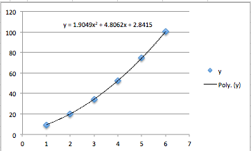
enter image description here

A nice smooth curve was fitted that looks like a good match to the data - and you can see the equation of the curve. However - in this case the actual function I used was $$y = 0.5 + 3x + 2x^2 + 4\sqrt{x}$$ - and in Excel there is no good built in way to find the coefficients (0.5, 3, 2, 4) . It is possible to use Excel to find these coefficients, by manually recreating the math needed for the calculation. If you have data points $x_i, y_i$, and you believe that $y$ is a linear combination of various functions $f_i(x)$, you can do the following:

Compute the matrix

$$F_{ij} = f_i(x_j)$$

Next, compute

$$M = F F^T$$

Finally, compute

$$Y_j = y_i F_{ij}$$

Now the solution is

$$c = M^{-1} Y$$

I have created a small example (from which the above graph was created) that shows how this is done in Excel. First, the formulas:

enter image description here

And next, the values:

enter image description here

Note - a lot of the matrix calculations (MMULT, MINVERSE) require you to select the entire range where you need to put the formula, type the expression in the formula bar, then press CMD-SHIFT-ENTER on Mac, or CTRL-SHIFT-ENTER on PC. You can find a copy of this spreadsheet at http://www.floris.us/SO/curveFit.xlsx

If you want to be really clever, you can do something similar for the non-linear case - but now you will have to use the Solver (comes with Excel) to solve for all the parameters.

Now you can really impress your teacher with your new found data fitting skills... but the bottom line is still this:

You need to understand why the function you are fitting is of a particular form; if you don't, then it doesn't matter how good you are at fitting data - you are not really "doing physics".

If you do understand the form, then the coefficients you are solving for might be meaningful things like "viscosity of air", "gravitational constant", "apparent area of cup", or whatever else your experimental analysis tells you that you're solving for.
$\endgroup$

Your Answer

By clicking “Post Your Answer”, you agree to our terms of service and acknowledge you have read our privacy policy.

Not the answer you're looking for? Browse other questions tagged or ask your own question.