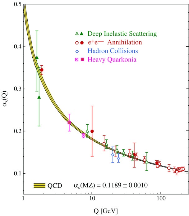
The simplest approach is to try and understand what that plot is really measuring. The answer is not too deep, pun intended: the measurement is a scattering cross section. Which is then compared to the analytical prediction.
The theoretic prediction is as follows. (You can find the details in any introductory book on QFT.) Long story short, to tree level, the scattering amplitude is given by (the Fourier transform of) the Coulomb potential, namely
$$
\mathcal A(Q)=\frac{e^2}{Q^2}+\mathcal O(e^4)
$$
where $Q$ is the exchanged momentum and $e$ is the basic coupling constant. The $\mathcal O$ term denotes loop corrections.
The key point is the following. The result above is an approximation; in the full theory, the scattering amplitude is given by some function $\mathcal A(Q)$ which is very hard to calculate. But it is given by some function. So we go ahead and define
$$
\mathcal A(Q):=\frac{e(Q)^2}{Q^2}\tag{$\star$}
$$
where $e=e(Q)$ is some new function, which again is very hard to actually calculate.
We can now measure $\mathcal A(Q)$ in the lab: we smash together particles with momentum $Q$ and count how many photons are produced. We can then use the definition above to find the function $e(Q)$ and plot it. The result is the graph in the OP. (Actually what's graphed is $\alpha(Q)=e(Q)^2/4\pi$ but of course this is a minor change and it does not affect the discussion.)
So the graph is not, strictly speaking, measuring a running coupling. It is just measuring a scattering cross section, and using the definition $(\star)$ to reverse-engineer an effective coupling $e(Q)$. This effective coupling is useful because we can, intuitively, think of the full scattering process in QFT in terms of the standard scattering we are used to in classical mechanics, up to a redefinition of the coupling constant, which now becomes a function of the energy of the process. At any given (fixed) $Q$, the scattering process is essentially the classical answer, just evaluated at a coupling constant that varies with the energy of your experiment.
This would be even more useful if we were able to actually compute $e(Q)$, but this is just as hard as computing $\mathcal A(Q)$ in the first place. At least in perturbation theory, we know that $e(Q)=e+\mathcal O(e^2)$ where $e$ on the right-hand-side is the standard coupling constant. Using Feynman diagrams one can compute higher order corrections, if one wishes so.
It turns out that we can do slightly better. Using a sophisticated version of dymensional analysis, one can resum "large logs" in the series in $e(Q)$ to find a much better approximation for this function, see ref.1 for the textbook analysis. The "sliding scale $\mu$" trick is just (a very efficient) way to resum the logs. A better approximation for the effective coupling is $e(Q)\sim e/\log Q$. And the plot in the OP shows that this improved approximation agrees rather well with measurements. One can of course make more precise measurements, and find better approximations for $e(Q)$ (resuming sub-leading logs, for example), and the agreement further improves.
In any case, let me emphasize: the figure is a measured cross section, as a function of the exchanged momentum $Q$, both concepts being as "real" and observable as it gets. The figure is not a plot against the sliding scale $\mu$. The sliding-scale trick is just a nice story we tell ourselves in order to actually compute the dependence of the scattering cross section as a function of the exchanged momentum. It is a (very useful) computational technique.
References.
- Weinberg S. - Quantum theory of fields, Vol.2, §18.

